by Michele Tobias, DataLab Geospatial Data Specialist
Background
Johns Hopkins’ Center for Systems Science & Engineering (CSSE) has collected and publicly posted data related to the spread of COVID-19 on their COVID-19 GitHub repository since January 22, 2020 and their interactive dashboard quickly became a popular source of data visualization for COVID-19 global data. The dashboard has several visualization options – maps, graphs, and tables – but I was curious to explore this source data myself and ask some questions not presented in the dashboard – particularly about California’s counties.
How does the reported number of cases change over time? How do some counties compare with others?
The R code for all of the data scraping, cleaning, exploration, and visualization steps can be found on the DataLab COVID-19 Data Visualization GitHub Repository in the JohnsHopkins_CountyData.R file. This is a self-contained script that downloads all the data needed from internet sources.
Data Acquisition
For this data exploration, I used data from two sources:
- Johns Hopkins’ CSSE’s COVID-19 Daily Reports – daily updates of number of cases, number of deaths, and related data.
- World Population Review’s California county population estimates for 2020
Acquiring the COVID-19 daily reports data was straight forward. Because it is stored in a GitHub repository, I downloaded the .zip file of the whole Johns Hopkins’ CSSE’s COVID-19 repository. The download contains some extra things I don’t need, but the file size was not large enough to worry about some extra text files.
Finding accessible population data was surprisingly challenging. To make a long story short, I used web scraping methods to scrape the HTML table of CA county populations from the World Population Review page.
Data Cleaning
The daily reports data required quite a bit of manipulating to get it into a usable format. The workflow required the following steps:
- Read in the .csv files
- Account for different character encoding in one (or more) files
- Append the data sets together into one large data set
- Standardize the date format
- Re-format the tables from long-format into wide-format so that there is one row of case data for each county with columns for each day
Cleaning the population data was much quicker. The only concerning aspect of this data was that the population numbers were characters with commas separating the numbers for readability and that they read in to R as characters. I removed the commas and changed the characters to numbers.
Data Exploration & Visualization
I’d like to explore how UC Davis’ home county, Yolo County, compares with nearby counties, Sacramento and Solano, and with our state’s largest county, Los Angeles County, so I built a graph showing the number of cases in each county over time. The daily reports data begins documenting cases by county on March 22, so the analysis is limited to data from that date and newer.
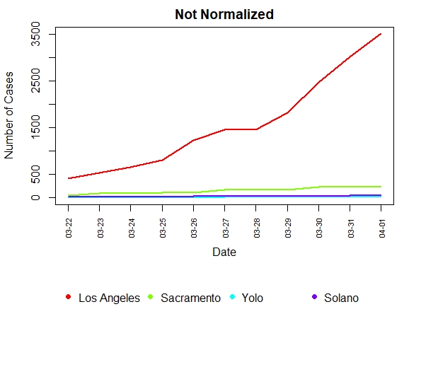
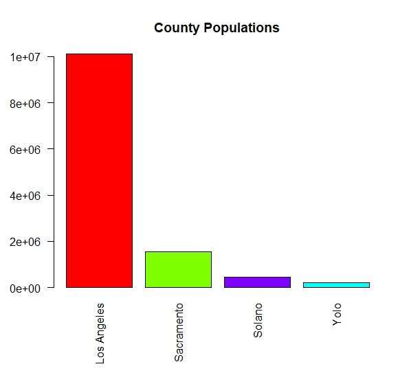
From this graph, it looks like counties in our area are doing very well compared with Los Angeles County, however, upon seeing many graphs just like this in news articles comparing different geographic divisions (countries of varying sizes vs. states vs. cities, etc.), I realized this kind of graph is difficult to interpret. Los Angeles County has a population of just over 10 million people but Yolo County has about 220,000. This means that the potential number of cases in these counties is very different.
Even if we know this, it’s hard to compare the curves for these counties given that they are not on the same scale. The curves for Sacramento, Yolo, and Solano counties look very flat and not much different from zero, which we know is not the case. So I was curious to see how this graph changed if I normalized the number of cases by the population of the county – calculating cases per person, which we expect to range from zero to one for all the counties.

Normalizing the number of cases by population makes comparing the curves easier because they have the same range of values. The highest any of these curves can reach is 1. Interestingly, we can see that on March 23, Sacramento County reported more cases per person than Los Angeles County. Generally though, our local area has fewer cases per person than Los Angeles County and our reported rate of increase appears to be lower.
This graph is helpful, but still may not tell the whole story. The idea of cases per person is a little hard to conceptualize and may not be intuitively understood by everyone who might read the graph. It also doesn’t illustrate the magnitude of what each county is trying to deal with in terms of logistics and finances. Number of cases (not normalized) would be better to illustrate that case.
Conclusions
So which is better? Should we normalize? Should we not normalize? Which graph you present should be driven by the story you want to tell, giving appropriate context so readers can make an informed judgement for themselves. Sometimes it’s better to present both side-by-side so the reader has all the information. This can also give your reader a clue to spend time reading the text for an explanation, not just looking at the figures.

The moral of the story here is that data needs to be presented carefully. Data as it comes from a source may need cleaning and analysis before you can start your visualization process. Think about the best way to illustrate the conclusions you draw from the data set.
At this point, I would like to acknowledge that a number of factors are at play making these graphs difficult to interpret regardless of whether or not you normalize the data. Testing criteria changes daily and access to testing is uneven in both space and time. Reporting of test results is also unlikely to be complete even if tests are performed. Additionally, our county samples are not independent. There is a fair amount of exchange of people (and therefore virus) across county lines even during the stay-at-home order.
I hope that this post and the accompanying R code illustrates a few things:
- How to download, clean, and work with the Johns Hopkins COVID-19 dataset
- That you should carefully consider how you present data because it can impact the way your readers understand a given data set
Contact Us!
Did you use our code as a starting point for your own work? Do you need a data scientist to join your research team for COVID-19 projects? We would love to hear from you! Email us at datalab@ucdavis.edu